Creating ads that capture attention, and convince people to open their wallets isn’t easy. If it were, everyone would be doing it successfully. To achieve a high return on ad spend, you’ll need to learn from others and think creatively to use your available assets to tell a compelling story.
While we have found a combination of assets and copy that generally work really well for crowdfunding campaigns, we get it wrong sometimes too. Let’s look at what worked, and why. And then what didn’t and why. Maybe you can learn from what we’ve tried. Both what to do and what not to do. It’s important to keep a few different ads running and not put “all of your eggs in one basket”. Remember, Facebook works on an algorithm that is always changing. It’s trying to find the right person to show your ads to. People will also begin to see your ads more than once and you’ll want to stay in front of them with different ads. Each time a potential customer sees your ad, it should be different For this reason, we recommend trying to find at least 3 ads that perform well to run for the duration of your campaign.
Dog Treat Dispenser
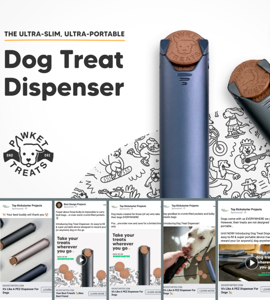
Dog Treat Dispenser is a pocket-sized holder and dispenser for Pawket’s sustainably sourced dog treats. We helped Pawket raise $80,307 from 1,546 backers on Kickstarter. When setting up ads for this crowdfunding campaign we ran multiple ads simultaneously using three different combinations of assets and copy. Some were image assets, some videos, short copy, long copy, and everything in-between.
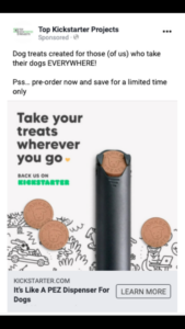
Ad 1 —
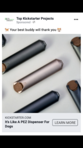
This was the best performing ad for this campaign. With 134 conversions, 246,564 impressions, and a 3% click-through-rate.
Why it worked:
The product shot clearly shows the product. The difference is how it shows it. It’s not a standard product shot. It has a different feel. This helps grab a user’s attention to get them to stop scrolling on Facebook and read the ad.
The copy and the headline are catchy and leave the viewer wanting to know more. This makes users click on the ad and go to the campaign page.
It’s just a simple ad. Sometimes those are the best, but sometimes they don’t work, so it’s always good to have other ad formats to try.
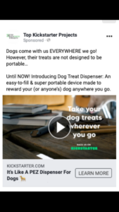
Ad 2 —
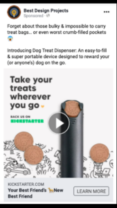
This was the second-best performing ad. It had 41 conversions, 83,333 impressions, and a 1.55% click-through rate. You’ll see there is a pretty large drop-off from ad 1 in performance.
Why it worked:
The overlay text on the video is an effective tagline and will help capture a user’s attention.
The video itself (which you can see here) is short and JUST shows what the product does. We have found that simple videos that are 10 seconds or shorter outperform their more complicated “feature call-out” videos that tend to be longer.
The copy starts with an attention-grabbing statement and moves into a short explanation of the product. This helps grab the user’s attention and quickly tell them about the product.
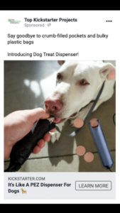
Ad 3 —
The third best-performing ad looks pretty similar from an asset standpoint to ad 2 but it uses a still image instead of a video.
Why it worked:
The tagline and the image are catchy, and the image itself leaves you wanting to know more. If you can find a way to stand out in the newsfeed you have a good shot of having a great performing ad.
The copy is short and sweet. It tells you (for the most part) what the product is and talks about the discount a user will get for backing the campaign on Kickstarter.
The headline is the same as ad 1 which is fine, we do this all the time. If you have a great headline use it in more than one ad.
Ad 4 —
This ad did not perform well. It still received conversions but overall it was not a high-performing ad. Here’s why that might be:
Why it didn’t work:
The video aspect ratio is 1200 x 628. Over the past couple of years, Facebook has started pushing square videos and images in the Facebook newsfeed. When possible, using a square aspect ratio. That is typically the best-performing aspect ratio. Of course, it never hurts to try other things because you just never know.
The video is about 20 seconds long (see it here). We mentioned earlier that we usually don’t see longer videos perform as well as those that are 10 seconds or less. That was the case here.
There is a lot of copy. This can sometimes deter people from clicking on the ad because they don’t want to read the copy. A tip for testing longer form copy is to start with a scroll-stopping statement or a question then lead the user through a story.
Ad 5 —
This ad also did not perform well for this campaign.
Why it didn’t work:
The only thing that really stands out is the image. A lot of times we find product shots perform the best. This image doesn’t show the product well and instead, emphasizes the dog.
Test different types of assets and different forms of copy because what worked for this campaign, might not be what works best for yours.
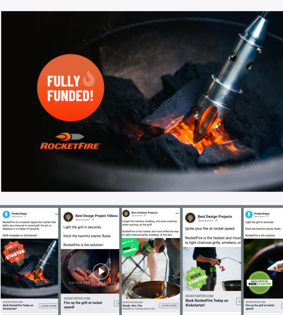
RocketFire
RocketFire is a fire starter that features advanced technology to light charcoal and woodpiles in just seconds. It raised $212,967 on Kickstarter with our help. Again, we tested several different assets and copy variations. What worked the best for RocketFire is slightly different than what worked best for Pawket.
We didn’t have many assets to work with for this campaign but we tested what we had and the results blew us away!
Ad 1 —
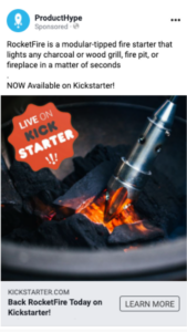
This was the best-performing ad throughout the entire campaign. It produced 109 conversions, 1,622,647 impressions, with a 1.40% click-through-rate.
Why it worked:
The image very clearly shows the product and the red fire in the image makes it stand out in the Facebook or Instagram newsfeed.
The red/orange “Live on Kickstarter” badge also helps this image stand out. If you’re targeting people familiar with Kickstarter it lets them know this is a crowdfunding campaign and that can help grab their attention.
The copy says exactly what the product is. There’s not too much and not too little. This allows the user to decide quickly if they want to click on the ad and potentially back the campaign.
The headline tells the user what action you ultimately want them to take. This works well for driving higher-quality traffic to the campaign page.
Ad 2 —
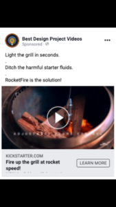
This short gif (view the gif here) was the second best-performing ad for RocketFire. It saw 46 conversions, 322,459 impressions, and a 1.79% click-through rate.
Why it worked:
The format of the copy in the ad is different. It’s short and choppy. That helps this ad stand out in the newsfeed.
The copy clearly tells you what the product does and why you would need it.
The headline is catchy and draws the user’s attention to the call-to-action button.
The gif is short and clearly shows the product and how it works.
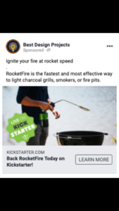
Ad 3 —
This image ad was another high-performing ad for RocketFire. With 23 conversions, 215,001 impressions and a 1.00% click-through rate.
Why it worked:
Let’s start with the image, it’s a close-up shot of the product combined with a lifestyle shot. It shows the product clearly and the user can get a good idea of how it’s used.
The ad copy starts with things the product can replace and ends with a quick description of the product. It’s catchy and informative without being overwhelming.
Finally, the headline is short and attention-grabbing.
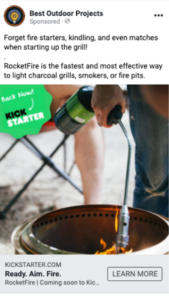
Ad 4 —
This ad was one of the worst-performing ads for RocketFire, receiving 1 conversion.
Why it didn’t work:
What stands out the most here is the image. Good assets make a difference.
The image is horizontal instead of square or vertical.
The image is not very clear and it is hard for the user to see the product.
Because the image doesn’t show the grill actually being ignited, it’s hard to quickly understand what the product is. You have to grab a user’s attention in a split second to get them to stop scrolling.
Ad 5 —

This ad also didn’t perform very well with just 5 conversions.
Why it didn’t work:
This is similar to ad 4. It’s hard to see what the product is.
While close-up product shots usually work well, this one might be a little too close up. Test a variety of assets to find what strikes the right balance.
While the copy is the same copy used in a successful ad, it’s important to think about how the copy will work with the asset. If your asset doesn’t do a great job of showing the product it’s very important you add a short description to the copy.
If you’re looking to run ads for your campaign, we hope you’re able to learn from what’s worked for us this quarter. A mix of copy styles with clear, compelling images is always a good idea, but figuring out the right combination takes a bit of patience and expertise. We know Facebook ads can be intimidating so if you need some help, reach out to us. We’d love to hear from you.
Work With Us
Want to learn more about how we’d prepare your product for launch? Request a quote today.
Want To See This Advice In Action?
Check out our case studies and learn more about how we’ve achieved stellar results for our clients.